
 Follow Us on Google Discover
Deprecated: mb_convert_encoding(): Handling HTML entities via mbstring is deprecated; use htmlspecialchars, htmlentities, or mb_encode_numericentity/mb_decode_numericentity instead in /var/www/nairametrics/wp-content/themes/nairametrics/functions.php on line 104
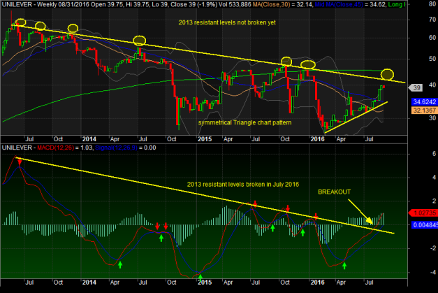
A quick look at Unilever shares on a weekly chart:
- A symmetrical triangle chart pattern confirmed from 2016 till date
- Upper resistant levels from May 2013 till date not broken (yellow circles)
- MACD broke its 2013 in July 2016. Good sign We more Leg ups in price
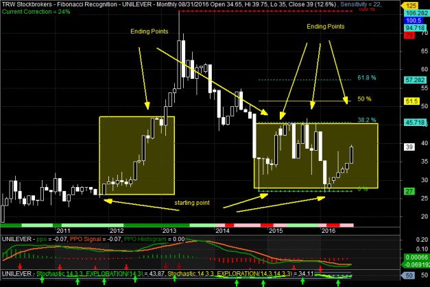
Unilever Monthly time frame has a trend pattern of moving from:
- 2012 to 2013 moved from N27.00 to N45.00
- 2014 to 2016 rallies have shown same trend of N27.00 to N45.00 plus range (from 0 to 38.2%fibonacci levels)
Other News
All in all
- N41.90 will be next resistant levels from the 2013 lines.
- N45.00 plus range still intact in long term
 Follow Us on Google Discover


Warning: Undefined variable $post_id in /var/www/nairametrics/wp-content/themes/nairametrics/comments.php on line 134
Warning: Undefined variable $post_id in /var/www/nairametrics/wp-content/themes/nairametrics/comments.php on line 134